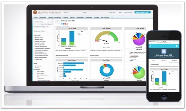
As of this year, Salesforce became the highest valued cloud based Customer Relationship Management (CRM) product at $50 billion dollars. Because of its skyrocketed popularity, Salesforce has deemed it necessary to move on from its prehistoric looking UI to a new, sleek design that enables people to work “faster, smarter, and more intelligently”. If you’re part of Salesforce’s 2.1 million subscribers, this update should excite you.
The Changes
Salesforce announced this as the first major changed they’ve made to their UI in 10 years along with the announcement of their 25 new functionalities.
Overall, the changes were created with the idea of making Salesforce as responsive, and modernized as possible, especially for those using mobile.
Salesforce has been overhauled to include:
New Lightning Design Interface: created to make workflows more efficient and clear, this new design fully harnesses the power of Cascading Style Sheets (CSS). The new CSS design component allows for Salesforce developer partners to create new components to function within Salesforce, making it fully customizable.
Lightning Salesforce “Experience”: Salesforce states that their new overhaul gives users a different experience that is more intuitive and intelligently designed. This is through their enhanced capability to keep the most relevant information at the top of the pile while unraveling previously complex workflows.
App Builder components through Lightning update: Finally available, the Lightning App Builder is made fully available for the end user through an easy to use drag and drop interface. The components involved in this interface are all new and built to be fully usable by all UI’s to perform infinite processes.
This new tool, utilizing components meant for customizing the Salesforce experience, is the highlight of the Lightning update. This is the update that Salesforce is touting is much more than just a simple visual upgrade, as it is supposed to guarantee an improvement in workflow efficiency.
This tool allows people to view essential data through visual representation in the fastest form possible. As people understand data in visual forms apparently 60,000 times faster than reading text, this was a request from a large percent of Salesforce subscribers. With this new visual approach, the bar graph is utilized much more than a listing of percentages and text describing the numbers.
Besides just these updates, the 25 new features they rolled out will all “be more productive and go faster” than ever before. Thus, their claiming of this move to be more than a small rebranding attempt, and more of an enhancement of existing services.
Image source: https://www.salesforce.com/form/conf/platform-lightning-app-builder.jsp
https://pixabay.com/en/info-infographic-design-information-908889/


